By forcing the typeface and graphics to squash to convey the moment when the fruit is pressed, the radiating lines and squashed graphics form a visual cue.
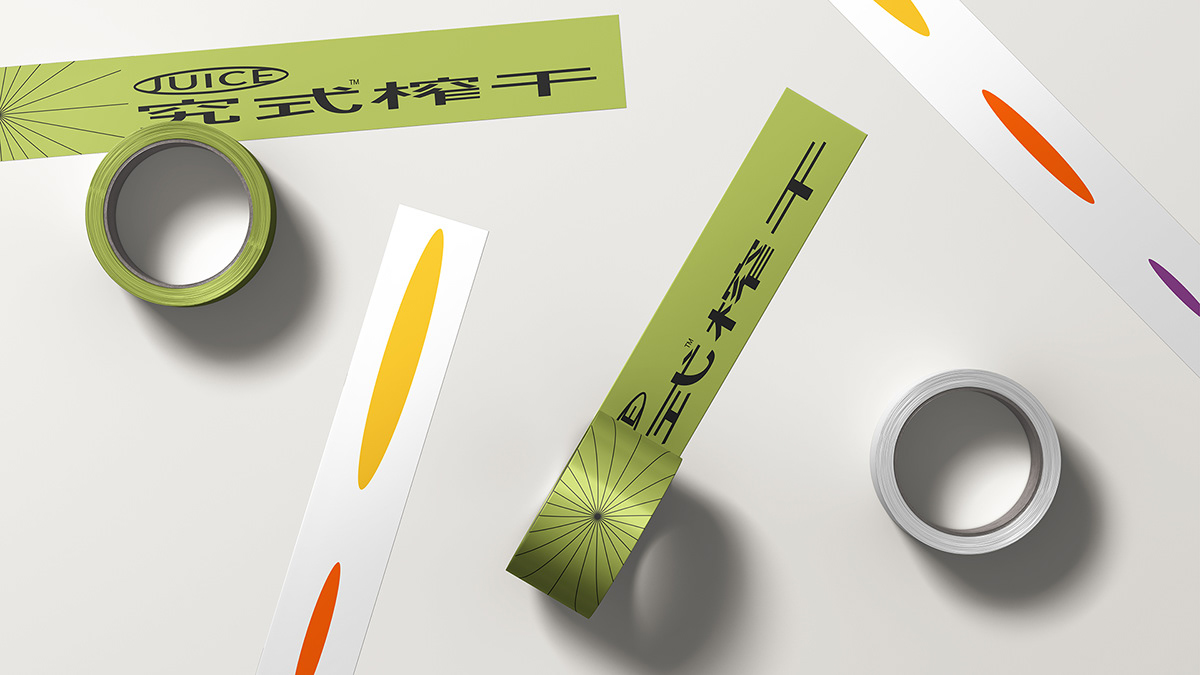
In the brand identity and product packaging, the bright colour scheme and the varying sizes of the graphics indicate the type of fruit, which, when combined with the lines, creates a flexible and rich visual language.
In the brand identity and product packaging, the bright colour scheme and the varying sizes of the graphics indicate the type of fruit, which, when combined with the lines, creates a flexible and rich visual language.
通过将字形与图形强制压扁来传达水果被压榨的瞬间,迸发的线条与压扁的图形形成了整套的视觉线索。
在品牌识别与产品包装上,通过艳丽的配色与大小不一的图形表示水果的类别,再与线条叠合出现,产生成灵活丰富的视觉语言。
在品牌识别与产品包装上,通过艳丽的配色与大小不一的图形表示水果的类别,再与线条叠合出现,产生成灵活丰富的视觉语言。